One of the most common reports and visualizations that a Compensation Practitioner needs is a salary grade chart that includes average market value and average salaries, by grade. There are many different kinds of visualizations that one could create, but here is a walk-through on how to create one that looks great and is fairly straightforward to develop. We’ve also created a tool that allows you to create one automatically and by clicking the button, below.
If you want to know how to do this in excel, this article will take you through the process, step-by-step. You can also download an example file, so you can follow along.
Step 1) Setting up the Data Table to Create the Salary Range Chart

To begin creating our salary range visualization, we need to first create our regular salary range table, such as the one on the left. This table will include your salary grade name, the minimum and the maximum. We also need to add 2 new columns labeled “Average Salary” and “Average Market Value” to the right of “Maximum.” Later on, we’ll use some an “AverageIf” formula to populate that info from your job table and your employee file.
Step 2) Setting up the Data Table
The second part of this process is to set up the data table so that the salary grade chart will be visualized properly, and to add the employee’s average salaries and the average market value for each job. The table will look the same, include the salary grade name, the salary grade minimum, the average salary and the average market value by grade – but will not include neither the midpoint nor the maximum. There are different ways to set this data up, but the way I have done it is by including an export of my employees (with salary grade, salary and salary compensation structures or tier if applicable) and a tab that includes all of my jobs market values, job codes and job salary grades.
Using an AverageIf formula allows me to find the average market data and average salary, by grade, which is used to populate the table. The formula and the results can be seen in the image below. Keep in mind, I have separate tabs with job and employee data that the AverageIf formula is referencing (based on the salary grade).

The midpoint and maximum will be created using a simple formula based upon the salary range table, in the next step.
Step 3) Calculating the Midpoint and the Maximum for the Chart
At this point, we already have our minimum, our average salaries, and our average market data, but we need to calculate our midpoint and maximum. This step is where we “trick” excel into creating a chart that looks like what we want.
For the midpoint and maximum columns, we are going to create a formula to calculate the difference between the midpoint and the minimum, and the difference between the midpoint and the maximum of the salary ranges. The resulting table should look similar to the table, below.

Step 4) Building the Combo Chart (in Excel 2010 and up)

Now that our table shows (a) the minimum of our salary range, (b) the difference between the minimum and the midpoint of our salary range, (c) the difference between the midpoint and the maximum of our salary range, (d) the average salary by grade and (e) the average market value, by grade, we can create our stacked column chart, which is show by the selecting the highlighted icon, found in the image below, in the center of the top row:

To create the stacked column chart, select our table, and then choose the stacked column chart in the insert tab of the menu ribbon. The resulting chart will appear like the one below.
All that is left now is to change the formatting so that the chart so it makes sense, and actually reflects your salary structure with average salaries and market data.
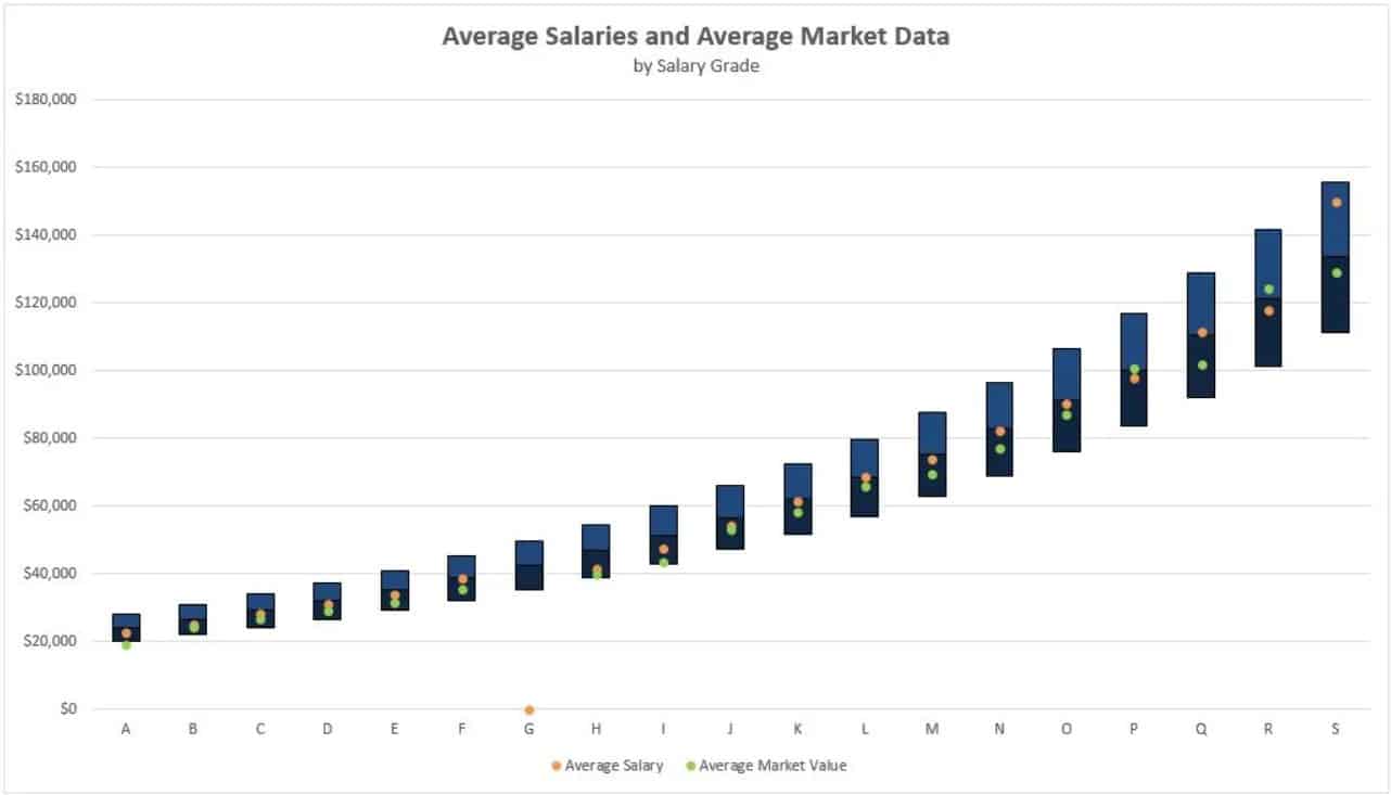
(Note that Grade ‘G’ has no employees or market data associated with it, hence it looks much smaller than the others)
Step 5) Formatting the Chart
Following the steps, below, will format the chart so it looks like the salary grade chart that probably made you want to read this article.
Substep 1: The first step, is to select the minimum and remove all color. This step will create the illusion that the salary ranges are “floating”.
Substep 2: Change the chart type for the average salary and the average market value from “Stacked Column” to “Overlapping Line Charts.” If you right click on one of the columns, and then select “Change Chart Type,” this will open this window:

Where you are presented with each data series and their corresponding chart types. By default, since you chose “Stacked Column Chart” initially, all of the charts types are set to “Stacked Column”. For this exercise, we want to change the “Average Salary” and “Average Market Data” series to “Line with Marker” which will update our chart so it looks like this:

Substep 3: Now that you have your average salary and average market values overlaying the salary structure, we need to finish formatting our chart. In order to do this do the following for each data series:
Step 6: Format the Average Salary and Average Market Data
Select the “Average Market Value” series within the chart, and right-click it open the Format Data Series window on the right side of the page. Select the Paint bucket and chose No-Line and choose the color that you want to fill the marker with. This will leave the markers but no lines and the data points will appear nested within your salary ranges.
Repeat the same steps as the Average Market Value for the “Average Salary”. That will result in your graph looking like the one, below:

Step 7: Format the Salary Ranges
Minimum: Choose the minimum and select “No Fill” to remove all the color from the chart. This will create the illusion that the column is floating.
Midpoint and Maximum: For the Midpoint and Maximum, all that’s left to do is change the formatting by selecting the color and adding a border (if you see fit). I recommend choosing a complementary color from the average salary and average market value so those data elements “pop”, but it’s completely up to you.
Step 8: Update the Legend and Add a Title
The last step is to update the title and the legend. By default the Legend shows the Min, Mid, Max, Average Salary and the Average Market Value. My recommendation is to completely remove the Min, Mid and Max from the legend, and have a clear Title for your chart.
This is what yours might look like, now that you’re finished:

Hooray. That’s all there is to it!
One response
This is a very cool article! But by ‘Average Market Value’ is it meant all of the jobs in Pay Grade A for example? We’re in the process of a comp architecture project and getting more of our jobs priced out using the external surveys!